LEARN@IGP
21
The CSS Editor
The CSS Editor is a major interface tool that allows you to define your print document layout and independently control each of the print, reader and writer CSS files from a highly functional, productivity driven interface. Updated: 2013-11-04
Overview
The CSS Editor allows you to modify all aspect of the Print, Writer and Reader CSS at a granular level. You can choose to use the CSS design tools such as IGP:Document Designer, or interact with the CSS directly.
The application includes specific Document setup for print, format CSS Editors and the unique feature CSS Calculating Comments.
This Topic explains the CSS Editor interface and high-level use of the application. The IGP:Digital Publisher Template Reference Manual gives more information on customizing templates.
NOTE: The default DPMaster-2012-1 CSS template items are very large and contain the CSS for many content genres. They are around 200KB and contain well over 7,000 lines of CSS code. The DPMaster-2012 template is designed to make it easy for a publisher to create custom templates for specific genres of content rather than be used for general production.
The Interface
The interface is designed to make it easy to move around a large and complex semantic CSS structure.
The interface allows you to view all the controlling CSS for the content pages.

The CSS Editor opens in a new window and gives immediate access to all CSS for all formats.
When you open a new book, the selected template CSS is split into the various sections and loaded into the database ready for work. This means it is possible to give access to specific parts of the CSS to assist learning, training and day to day use.
Main Toolbar (Left)

The left-side toolbar
The toolbar on the left allows you to quickly change between the Print, Reader and Writer CSS files. It also launches the Document Setup Panel.
Print. Show the Print CSS
Reader. Show the Reader CSS
Writer. Show the Writer editing panel CSS
Mobi CSS. Show the pre-defined Mobi CSS for Kindle Readers
Document. Open the CSS Editor Document Setup Panel
Search. Opens the CSS Search dialog to allow you to instantly find any selector, property or value in the CSS.
Main Toolbar (Right)

The right-side toolbar
Save. Click to save any edits you have made to the CSS. It is saving only the active selected stylesheet, not all stylesheets. Alternatively you can also use the keyboard short cut Ctrl+S to save any changes made in the CSS Editor.
Download. Download the complete current format CSS file to local. The CSS for the active stylesheet is assembled into a single file and passed for downloading. If you want to download all the CSS you will have to select each of the Print, Reader and Writer stylesheets and then click the Download button for each.
Upload. Upload a CSS template from another document. This is a separate operation for Print, Reader and Writer CSS templates.
Reset DD. If you have used IGP:Document Designer (DD) to modify a document and want to reset those settings, click Reset DD. Only the styles applied from DD will be removed. All other template CSS will remain the same.
Reset. Reset the current CSS format view to the default template values. All CSS edits you have made are lost for the active stylesheet. It is not just resetting the current view, but the whole stylesheet.
The Close button is on the top bar of the interface.
Close. Close the CSS Editor. When you click the Close button the CSS Editor is Closed. Remember to save your work first.
CSS Navigation Panel
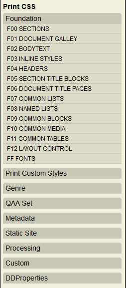
The CSS Navigation Panel lets you quickly move through the CSS directly to any structure you need to access.
You will probably be using the CSS Navigation Panel a lot in your work if you have a complex document to set out. It is organized in accordance with the IGP:FoundationXHTML (FX) CSS selector classification specification. This makes it relatively easy to move through the CSS and find your target selectors.
Here is an overview of the various panel options. You should familiarize yourself with the full FX specification for information on specific use of the selectors.
F0: Sections. FX defines over 100 sections across all content genres. However a specific template only lists those sections that are used for the target book genre. For example a standard book has Volume (infrequently), Part, Chapter; a textbook may have Unit, Lesson, LessonPart, a manual may have Topics, and an academic journal has Articles.
Sections are the enclosing tag for all content. They are structurally and semantically important, but they seldom require any styling except when being uses as a website or some other non-standard format.
F01: Galley. The galley-rw selector defines the extent of any FX document. It is where the core document style and flow properties are defined.
F02: Bodytext. Bodytext contains paragraphs. There are style, semantic, processing instruction paragraphs. There are also a number of document flow control presets where para meets headings and divs.
F03: Inlines. Inline styles are mainly span statements. There are style, semantic and processing instruction inline objects.
F04: Headings. FX defines the standard HTML h2 to h6 as headings. This can be extended with selector modifiers added to h6.
F05: Section Title Blocks. Title blocks contain styling for numbers, the title, sub-title, author, contributor and other paragraphs. There are styling options for all types of sections and documents.
F06: Document Title Page. The Document title page has it's own classification because of its importance in branding and as the leading page in a book.
F07: Common Lists. This comprises ordered, unordered and definition lists. Nesting is handled to five levels by default.
F08: Named Lists. Named lists is one of the biggest and most complex sections covering Table of Contents, all Lists of..., notes, references, index and a lot more.
F09: Text Blocks. Text blocks are semantic or styled blocks that are normally in the main document flow with their semantic purpose display through specific styling. Examples are abstract, extract, pull-quote, notebox and a lot more.
F10: Media Blocks. Media blocks contains both images and rich media. They are counter targetable if the images are figures, plates and illustrations.
F11: Tables. The default tables is a generic how-to set with some basic styling. Tables are always somewhat difficult to handle. There are default presentation and finance and business tables available.
F12: Layout. Layout handles columns, page and column block positioning, floats and more.
FF: Fonts. Font are given significant treatment in FX. In this section you can see the Font Scheme font declarations, the main font scheme CSS map and the default list of font feature styles. There is not much to edit in this list.
Print Custom Styles. Print custom styles handles all the page number generation, running headers and footers and more.
Genre. Default genres are poetry and drama. Drama is sub-set as stage, radio and screen drama for semantic styling.
The others. The other blocks assist the creation and presentation of various other genres and formats.
CSS Editing
The built-in CSS code editor is a relatively sophisticated Javascript application that assists you to create accurate and high-quality CSS.
It has a number of assistants to make editing the CSS comfortable.
Syntax high-lighting. The selectors, properties and values all have separate highlighting to make them easier to read and use.
Syntax auto-completion. Most of the CSS syntax is auto-completed to make editing CSS faster and more accurate.
Errors and Optimization Feedback. In the left column the application will provide errors of all types directly in the left margin.
CSS Search
Because of the large organized nature of the IGP:FoundationXHTML CSS the powerful search key helps you quickly move around the interface and instantly locate all styles.

The CSS Search dialog opens in a panel on the right side of the CSS Editor window.
Using CSS Search
- From the toolbar click the Search button. The Search Dialog will open.
- Type in your search term. This is can be part of a term as the search works on any character combinations not full words.
- Click Search. The results will appear listed by section in the result list.
- Click on the Section you are interested in working with. The selected section will immediately open in the main CSS window and the first term will be highlighted.
- Click on the Prev(ious) and Next buttons to move through all occurences of the searched term.
- When you have located the CSS you want to edit you can immediately start editing. You do not have to close the Search interface.
Document Setup Panel

The Document Setup Panel lets you quickly setup the page layout for your book or document.
The Document Setup Panel gives you all the main properties needed to comprehensively setup a reasonably complex trade or academic book to a defined typesetting specification.
When you open the interface for a book the first time it contains the template default settings. You can change them to your design requirements. When you click save the document CSS is updated.
The [F*] numbers in the blocks gives the FX classification value so you can quickly identify where the CSS changes are made when the Save button is clicked.
Setting Up a Book
Page Dimensions
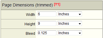
Page dimensions is usually the first values you will set unless the applied template already has the required values applied.
You can set the page height and width in Points, Picas, Centimetres, Millimetres, or Inches.
Bleed has the same dimension unit options. You only need to set bleed if your document has images that are bleeding outside margins. Otherwise leave it at zero (0).
Margins and Galley
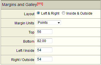
You can configure margins as Inside/Outside (standard for a book), or Left/Right (standard for manuals and other general documents).
You can set you margin units in Points, Picas, Centimetres, Millimetres or inches.
NOTE: You can only set the top and left/right or inside/outside margins. You cannot set the bottom margin so do not try. The bottom margin is automatically calculated as you set the line-height and line-count in the General Typographic Rules form fields.
As you set the line-height and line count you will be able to see the bottom margin value changing interactively.
A Note On CSS Page Layout
In standard typesetting specifications the inside-margin and galley width values are given (typically in picas). With the CSS model all margins are set and the page width minus the left and right margins determines the galley width.
Fonts and Flow
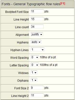
In this block you set the primary flow values and behaviours for the document.
Bodytext Font Size. This must be set in points.
Line Height. This can only be set in points. Note that as you adjust line-height the margin bottom calculation is running. So in the Margins and Galley block you can see that you are getting a realistic page margin-bottom value. If you want a different bottom-margin, you will have to adjust the combination of margin-top, line-height and line-count.
Line count. This value is a simple integer. It is the number of lines on a full galley page.
Alignment. This can be set to Justify or Auto. When auto is set the content is ragged right.
Hyphens. This can be set to Auto or None. Hyphenation is applied for both justified and ragged-right text when set to Auto.
Hyphen Lines. You can set the maximum allowable consecutive hyphenated lines from 1 to five.
Word Spacing. Word spacing can be adjusted if your house style requires it. It will have no particular effect if you have set Alignment to Justify
Letter Spacing. Letter spacing can be adjusted if your house style requires it. It can be adjusted +/- 0.5pt in 5/100 point steps.
Widows. Set the allowed widow line count.
Orphans. Set the allowed orphan line count.
Font Size 2. A secondary font size can be set from this interface for sections such as references, notes and indexes if that is a required house style.
Line Height 2. A secondary line-height can be set to work with Font Size 2.
Paragraphs

Setting Paragraph indents uses CSS properties. Typically you first set the paragraph indent to 0. Then with the p + p property (a CSS pseudo-selector) set the text-indent requirement for when a paragraph is following another paragraph.
Alternatively you do not have to use the CSS p + p method. Click the check box to turn this feature off. Now set the required paragraph indent in the Para indent field. The CSS contains context styles that will turn indenting off when paragraphs follow various blocks and lists.
For technical documents where you don't want indents, you can set the p + p value off by clicking the check box. You would then set the space below the paragraph to some value to provide paragraph styling.
Section Title Blocks
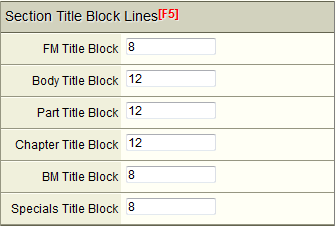
Title block heights are set in line-counts. Specifically that is multiples of the line-height you set in points.
For example if you set 12pts for line height and 12 lines for the title-block, the title-block height will be 144pts.
Part and Chapter options are provided to make it easy to apply custom values for standard trade and academic books, or other books that use the Part/Chapter section pattern.
The Part Title Block height is also used for Unit Sections in the default templates. Text-book editors should be aware of this. These options can be customized.
The Body Title Block option is used for all other documents such as manuals, journal articles, textbooks, reference works and other document genres which in particular do not use the Part/Chapter section nomenclature.
Headings
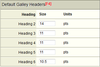
Heading margins are set in multiples of line-heights in the CSS to give page specific line-heights.
You can specify font sizes that do not exceed the top margin size and maintain the page baseline automatically.
CSS Calculating Comments
The Print CSS has configurable calculating comments included. This is a major productivity feature to assist you to get correct flow and page base-lining no matter what type-spec changes you make to the interface. They are set from the Document setup metric values that are applied.
A Calculating Comment looks like this /*(LHx1.5)*/. The calculation is in the parentheses between the comments. You can use negative numbers like /*(LHx-2)*/. This can be useful for indents and margins.
this example says set the point size of this CSS attribute to the line-height multiplied by 1.5. So if the line-height was 12pt, this value would calculate to 18pt.
There are a number of Calculating Comments available. When used correctly they make specifying every aspect of a book layout very simple.
Because they are just CSS comments they can be removed or edited at any time. They can also be experimented with or misused!
Calculating Comment List
Here is the full list without the CSS comments.
(FSx1) - Main Font Size with a modifying multiplier.
(FS2x1)- font-size 2 with a modifying multiplier.
(LHx1) - Main Line Height with a modifying multiplier.
(LH2x1) - Line Height 2 with a modifying multiplier.
(LHxBodyBlockHeight) Apply this title-block calculation to a specific title block.
(LHxPartBlockHeight) Apply this title-block calculation to a specific title block.
(LHxSectionBlockHeight) Apply this title-block calculation to a specific title block.
(LHxFrontmatterBlockHeight) Apply this title-block calculation to a specific title block.
(LHxBackmatterBlockHeight) Apply this title-block calculation to a specific title block.
(LHxSpecialsBlockHeight) Apply this title-block calculation to a specific title block.
(LHxLineCount) can be used to create a blank page.
Usage Examples
Assume starting font-size/line-height is 10/12pt.
You need to set the margin values of Heading 2.
h2
margin-top: 24pt;/*(LHx2)*/
margin-bottom: 12pt;/*(LHx1)*/
}
Next you change the font-size to 11.25pt and the line-height to 14.5pt. After calculation the above values become:
h2 {
margin-top: 29pt;/*(LHx2)*/
margin-bottom: 14.5pt;/*(LHx1)*/
}
You want to apply FS2 to References:
list-reference-rw p {
font-size: 9pt;/*(FS2x1)*/
line-height:11pt;/*(LH2x1)*/
text-indent: -18pt;/*(FS2x-2)*/
margin-left: 18pt;/*(FS2x2)*/
}
Notice you can use minus numbers in the calculations. This is primarily useful for hanging paragraph structures.