LEARN@IGP IGP:Writer
11
The Sidebar Menus
Interface
- The Sidebar Tools
- Opening and Closing the Sidebar
- To close the Sidebar
- Open the Sidebar in overlap mode
- To reopen the Sidebar in push mode
- To Resize the Sidebar
- Expanding and Collapsing Sidebar Tools
- 1. Table of Contents
- Organizing the TOC
- 2. Content Blocks
- Context Sensitive Sidebar
- 3. Project Components
- Project Components Toolbar
- 4. Global Components
- Global Components Toolbar
- 5. Flow
The Sidebar Tools
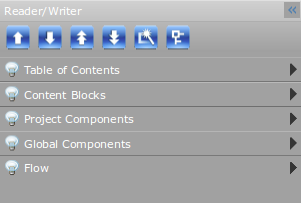
11-1 The Sidebar Menus when they are all closed. These are accordion menus, clicking one will open it, clicking any other menu will close the open one, and open the selected menu.
There are a number of important tools menus in the lefthand Sidebar to make your work with any document easy. Both the Sidebar and the Sidebar Menus are interactive. The sidebar menus are:
- Table of Contents: This is the Table of Contents (TOC) for this book.
- Content Blocks: This menu contains the default Content Blocks. You can change and modify these at any time. These are available for all documents.
- Project Components: This menu contains project files. Upload and use any file such as images, media and downloadable files. These will only be available to users with editing access to this document.
- Global Components: This menu contains the default Global Components. This includes: logos, icons, graphics, files and media. These are available for all documents.
- Flow:This contains tools to control spaces, hyphenations and line breaks in a document.
Opening and Closing the Sidebar
To maximise screen editing room on smaller monitors, and to adjust your workspace to your preferences the Tools Sidebar can be easily opened and closed. It has two visible modes - Push, and Overlap.
To close the Sidebar
Click once on the Close button. Immediately the Sidebar will collapse to the left. You will see a blue interaction bar down the left side of the screen with the Open Icon at the top.
Open the Sidebar in overlap mode
When the Click once anywhere on the blue interaction bar (but not the Open Icon). The Sidebar will open overlapping the editing area. You can use all menus inside the Sidebar normally. When you click outsidoff the Sidebar, for example on your page content, the sidebar will immediately close.
To reopen the Sidebar in push mode
in Push mode, click once on the Open button. Immediately the Sidebar will expand and resume its default position.
To Resize the Sidebar
You can change the width of the Sidebar up to approximately 30% of your screen width. Use the Border handle and drag it left and right to a suitable width. The Sidebar will remain at the size you set it until you change it, or close the editor. This is useful if you have long TOC Item titles, or if you want to see a number of icons in any of the Sidebar Menus
Expanding and Collapsing Sidebar Tools
The Sidebar contains a number of expanding menus known as accordion menus. These open and close together as you click on them.
- Click once on an Accordion header bar to expand the selected menu. Any other open menu will collapse.
- Click once on the Accordion header bar to close the menu. All menus will be visible at the top of the Sidebar area.
- Sidebar menus can be snapped off and placed anywhere on the screen. Click and drag the menu. Release the mouse button when the menu is in the position you want it. It will always remain on top. You can resize the height and width of the menu.
- To return the menu to the sidebar, close the Menu, and drag it back to the Sidebar. When you release the mouse button the Table of Contents will snap back into place
- The TOC menu can be snapped off and placed anywhere on the screen. Click and drag the menu. Release the mouse button after placing the menu where you want.
- To return the menu to the sidebar, close the Menu, and drag it back to the sidebar. When you release the mouse button the Table of Contents will snap back into place.
1. Table of Contents
The Table of Contents is available in the Table of Contents Accordion Menu.
To expand the menu, click once on the TOC Accordion bar. Similarly, click the bar again to close the menu.
The TOC menu can be snapped off and placed anywhere on the DP interface. Drag the menu and place it anywhere you want on the screen. To return the menu to the sidebar, close the Menu, and drag it back to the sidebar. When you release the mouse button the Table of Contents will snap back into place.
Organizing the TOC
When you are in Document mode, you can edit the Table of Contents. You can organize your Table of Contents at any time. Highlight any TOC item and use the following controls.
- Move TOC Item Up: Click this to move an item up one position.
- Move TOC Item Down: Click this to move an item down one position.
- Move TOC Item to the Top: Click this to move an item to the top.
- Move TOC Item to the End: Click this to move an item to the bottom.
- Rename TOC Item: Click this to rename a TOC Item. A dialog will open. Type the new name into the box provided and Click OK. The name will be instantly changed.
- Publish Reader TOC: The IGP:Reader TOC is only synchronized with the IGP:Writer TOC when this is clicked. If you add pages and do not click Publish Reader TOC, the page will not be visible in IGP:Reader.
2. Content Blocks
In the Content Blocks accordion menu, an on/off button is provided to allow users to start/stop the dynamic content blocks. User can use the dynamic content blocks while tagging. The dynamic blocks can also be turned off when authoring, editing and styling the content.
Content Blocks is a large library of pre-design blocks covering nearly every requirement in a wide range of documents. You have complete control over Content Blocks and any changes will reflect through to all users. You can upload new Blocks, view the HTML code to copy them as well as delete unused or unwanted ones.
Content Blocks are the document personality items in the template system. A wide range of Content Blocks can be inserted into a document, which will pick up the correct layout of and characteristics from the document or layout templates.
Content blocks are categorized for display. The categories are displayed in a dropdown combo-box. Selecting a specific category displays its content blocks.
The list of categories in the dropdown menu are:
-
A - Text Blocks
Text Blocks contain a list of content blocks for insertion of sidebar, computer codes, extract, notebox and many more.
-
B - Styled Paragraphs
Styled Paragraph contains various paragraph layout style. The list of available styles are:- Alternate
- Hanging
- Indent
- Line Leading
- Decoration
-
C - Named Lists
Named lists are very important in Publisher documents and allows the structural segmentation of large lists such as indexes, references, glossaries and similar. -
D - Communication
The list of available styles are:- Letter
- Instant Message
- Text
-
E - Media
This category contains a list of content blocks for insertion of various types of media ranging from images, audios and videos. -
F - Table
This category contains the layout table block which can be inserted in any part of your document.
The list of available classes in the block are:- Classic
- Modern
- Grid
- Layout
-
G - Layout
This category contains a couple of content blocks with which you can apply a number of different column layouts to your document as well as provide added control over block flow and float behaviour.
The two content blocks are:- Column Text
- Layout Control Block
-
G1: Poetry
The Poetry category contains all the content blocks necessary for developing a poem like Stanza, Body, Notes, Line notes etc. -
G2: Drama
This category contains all the content blocks that helps in the construction of a play/drama. Content blocks include Scene, Act, Drama Title block, Entracte and many more. -
H - Format Metadata/Processing
This category contains content blocks that help in the customization of a book/document so that it becomes readable in specific devices.
The Content Blocks are:- Limited Device File Break
- Kindle Image Metadata
- Table Replace Metadata
Context Sensitive Sidebar
The context sensitive sidebar comes under the Content Blocks Accordion menu. Depending on the current block a user is in, Digital Publisher displays the Context Sensitive Sidebar. The Sidebar changes as user moves through the content with the help of the navigation keys in the keyboard. The context sensitive sidebar can also be activated by clicking inside the blocks.
The content block sidebar provides three options:
- Header: A user can place the cursor inside a para or a header (h1 to h6) and convert it to the preferred structure.
- Paragraph: A user can place the cursor inside a para , li, td and th and set the class attribute using paragraph tools. The paragraph tool works as a toggle.
- Inline: A user can select some text and wrap them with specific span tag using inline options.
3. Project Components
Project Components are where you store the images, media and other items for a specific book. It allows you to upload and manage all of the graphical content for a specific publication in one place. This makes the book portable, and even when you add global components, copies will be placed into this directory.
Project Components Toolbar
- Upload: Click the button to upload images, media or any other items of a specific book.
- Refresh: Click the button to refresh and update the various components of the given folders.
- Delete: Click the button to delete any items from the list of Project Components. You should first select the item that you want to delete.
-
TAH: Click the button to edit the Design profile of a document. Design profiles are saved as Custom Styles in the TAH (Titles and Headers) style sheet.
- Download: Click the button to download any item from Project Components into your local system. You should select the item first before downloading.
4. Global Components
Global Components are available from every book and may be useful within the organization for inclusion in a wide range of documents.
Global Components are common for all documents whereas Project components are only for a specific project/document.
These are organised by media type:
- Logos: You can use this directory to store standard business and imprint logos, banners, and other items that are used regularly in documents. Remember to store everything in both online and print resolution.
- Icons: If you have standard icons that are used repeatedly in different documents, this is the place to store them so all authors and editors can access them at any time. The default installation comes with a collection of around 50 icons which you can use, or delete and replace with your own. If you make your own icons, remember to create print and online resolution images.
-
Default Images: This directory allows you to store a collection of regularly used images. The default one-drop.jpg image is stored here by default, plus a number of other useful items. You can store any images you like here.
- Download Files: This directory is designed for the storage of regularly used downloads. They can be any format: PDF, presentations, documents, etc. When you are using IGP:Digital Publisher to create online content you can immediately incorporate these into your Web page. These files are not of any use in a print document and cannot be included into the print output.
- Rich Media: This directory is designed for the storage of regularly used rich media components like video files, audio files and ShockWave Flash.
Global Components Toolbar
- Upload: Click the button to upload images, media or any other items which may come in use in majority of documents.
- Refresh: Click the button to refresh and update the various components of the given folders.
-
Delete: Click the button to delete any items from the list of Global Components. You should first select the item that you want to delete.
- Download: Click the button to download any item from Project Components into your local system. You should select the item first before downloading.
5. Flow
With the help of the Flow Accordion menu in the sidebar; spaces, hyphenation and line breaks can be controlled.
The list of tools available in the Flow Accordion menu are:
- Print Insertion Point: This tool is used to insert a print insertion point if you want to move an image to a particular location in your print outputs only.
- Insert Soft Hyphen: This tool controls the hyphenation of words if it occurs at the end of a line. To insert Soft Hyphen, place the cursor where you want the word to be hyphenated and then click the button.
- Insert Non-Break Space: Sometimes you want words to stay together in the same line without breaking. This tool prevents a line from breaking between two words. To insert a Non-Break Space, place the cursor between the two particular words and then click the button.
- Insert Zero-Width Space: This tool is used to force a line to break at a particular point even when there is no space in the text. Place the cursor where you want and click the button to break the line.
- Insert Thin Space: This tool helps in maintaining a thinner space between two words compared to others spaces in a document. To insert a thin space between two words, place the cursor between them and click the button.
- No Hyphenation: Sometimes a word gets hyphenated when it is positioned at the end of the line. To prevent a word from being hyphenated, highlight the word and then click the No Hyphenation button.